
Layout
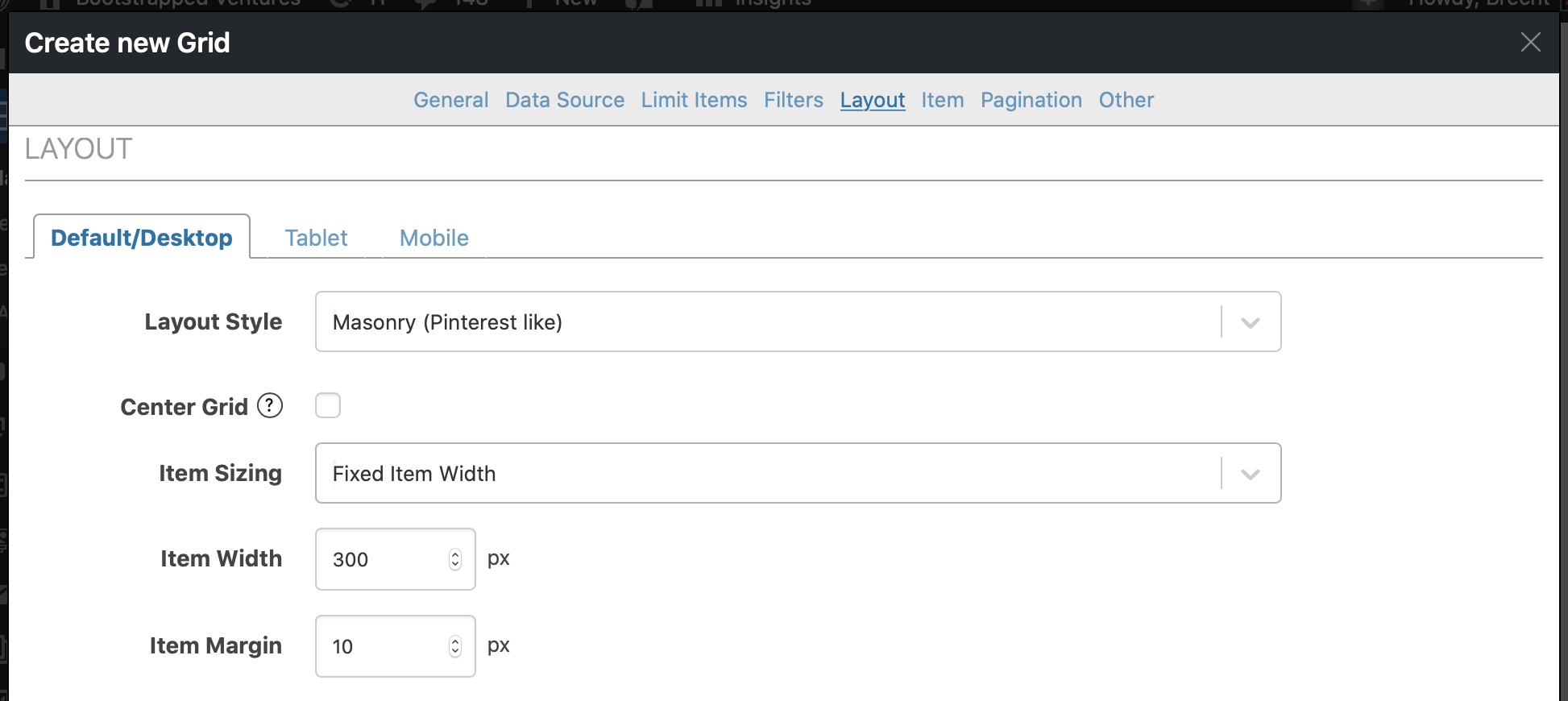
With the Layout tab you can change the overall layout of the grid.
There are 2 different layout styles: “Masonry” (think Pinterest) or “Items in Rows”. You can easily check the difference using the preview.
Item sizing decides what the size of the individual items in the grid will be. You have the following options:
-
Fixed Item Width
Specify the exact width in pixels you want the grid items to be.
-
Set number of Columns
Specify the number of columns you want there to be in your grid.
-
Let template control sizing
For advanced usage where you specify the width elsewhere.
Apart from the Default/Desktop style you have these same options for tablet and mobile. The breakpoints for switching between these device widths can be set on the Grids > Settings page.